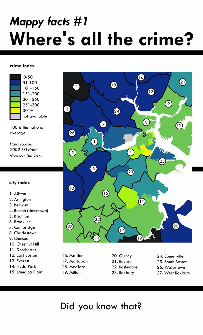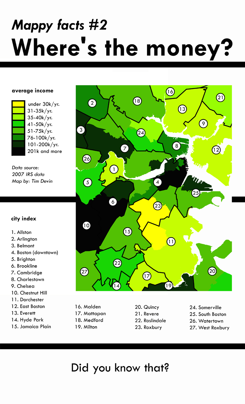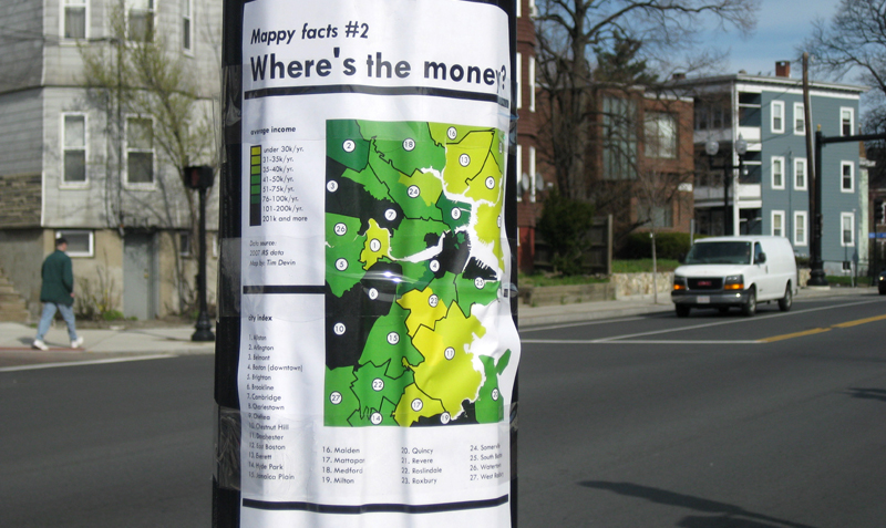
In early 2011, I started printing up my Mappy Facts posters. They were full-color infographics, showing statistics on crime and income inequality in the Boston area. They looked like patchwork quilts-some areas with very high wealth were surrounded by low income areas, and vice versa. How was this possible?
I put them up throughout the city. My name was on them in small print, but it must've been too small, because suddenly some newspapers were trying to figure out who the "info bandit" was. From there, my posters went viral, attracting international media attention, and bringing up difficult questions about how our communities function.
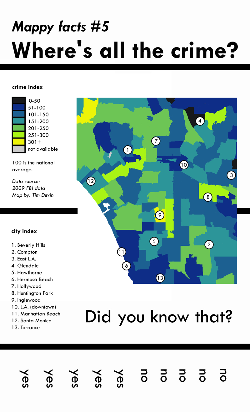
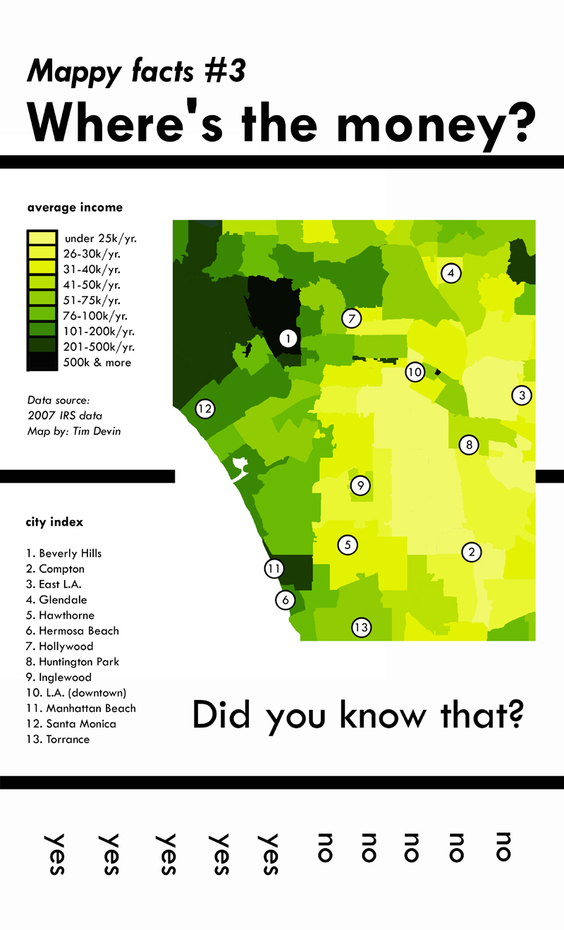
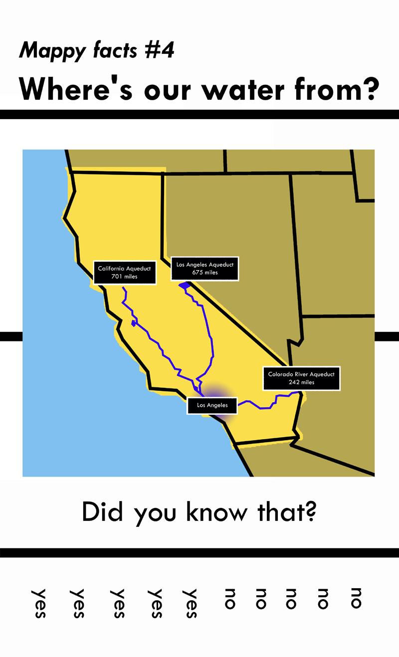
In addition to the Boston signs, I also made some maps about Los Angeles for an art show in the summer of 2011.
Learn more
Andrew Price. "Artist posts neighborhood surveys and infographics on the streets of Boston." San Francisco CA: GOOD Magazine. May 17, 2011.
Andrew Vande Moere. "Broadsides: showing infographics...in the street." Flanders, Belgium: Information Aesthetics. May 23, 2011.
The Callie Crossley Show. Boston MA: WGBH. June 13, 2011.
Janelle Nanos. "Somerville street art." Boston MA: Boston Magazine. May 24, 2011.
Joshua Rothman. "Somerville's mystery posterer revealed." Boston MA: The Boston Globe. May 23, 2011.
Matteo Bittanti. Urbano troppo urbano: quattro modi di visualizzare le citta." Milan, Italy: Wired.it. May 25, 2011.
Nicholas Ganz. Street Messages. Sweden: Dokument Press. 2015.
Sebastian Campion. "Boston street surveys, infographics and poems." Copenhagen, Denmark: Guerrilla Innovation. May 17, 2011.
The posters